RUHA STENCIL WORKSHOP / ALGARVE DESIGN MEETING (FARO)
 Tipos das Letras went to the city of Faro (Portugal) to give the Ruha Stencil Workshop and also we had an exhibition at the Algarve Design Meeting. Nice event, place and people, thank you for the invitation!. Fábrica da Cerveja (Faro). Workshop Photos (Flickr). [22/05/2016]
 This year me and my colleague and friend Pedro Amado were invited to give a workshop (Desenho Ágil de Tipos de Letra) at the national meeting of design students in the city of Coimbra (Portugal).
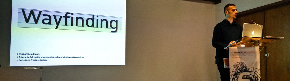
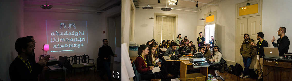
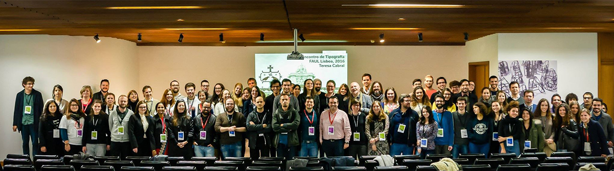 The sixth edition of the Typography Meeting (6ET) is an event promoted and organised by the Portuguese delegation of the Association Typographique Internationale (
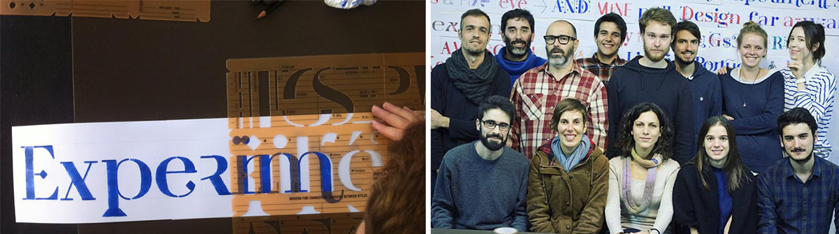 Ruha letter stencil, a multi stylistic typographic system workshop (EXD15). This project was initially developed as a teaching tool for graphic design students to learn from experiment letter shape as a significant in graphic communications. Afterwards, it imposed itself as an autonomous project, materialising into a product for all the community.

 The handwriting typeface Escritura was created for editorial purposes and the letter forms are influenced by chancery handwriting from the Italian Renaissance. The asymmetrical shapes of the undulating serifs cause the characters to have a large aperture. Originally designed for display sizes, the typeface also comes in a text version for small sizes. With taller vertical proportions, the text version has slightly longer serifs and increased white space between the characters to optimize legibility in small sizes.
  Now you can find our typefaces on FONTSPRING website, the first release was Van Condensed typeface. The associated


