ABOUT THIS TYPEFACE
The handwriting typeface Escritura was created for editorial purposes and the letterforms are influenced by chancery handwriting from the Italian Renaissance and the cartography maps from that period. The asymmetrical shapes of the undulating serifs cause the characters to have a large aperture. Originally designed for display sizes, the typeface also comes in a text version for small sizes. With taller vertical proportions, the text version has slightly longer serifs and increased white space between the characters to optimize legibility in small sizes. Ascenders and descenders and serifs are shorter in the display version, which has more economical letter spacing resulting in a visually compact text image. The stress in the letter strokes create changing widths according to their direction, improving the calligraphic rhythm in the characters. The oblique crossbar as well as other typographic details lend the typeface that typical Renaissance atmosphere.
TAGS
Serif, Display, Decorative, Latin, Hebrew, Text, Optical Sizes, Renaissance, Humanist
BUY

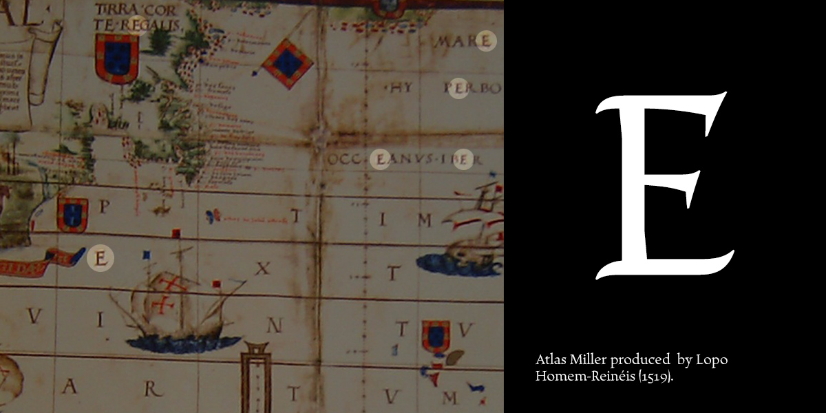
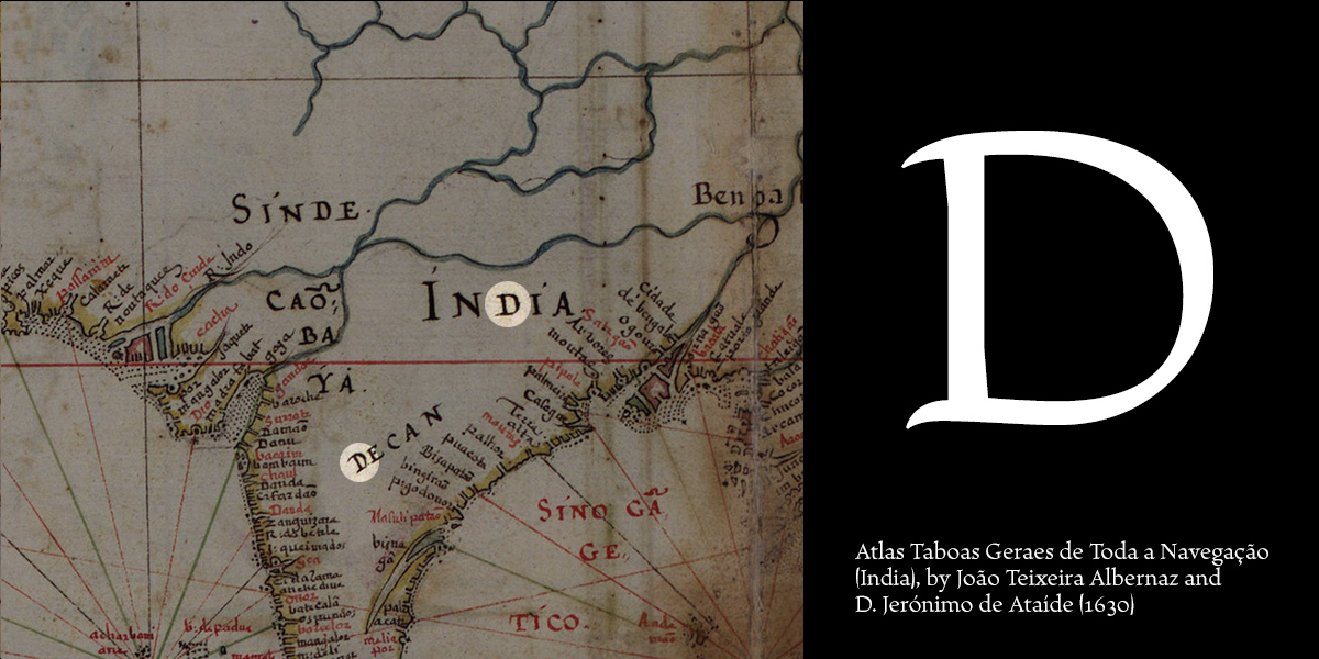
 [1] Calligraphic references from the Portuguese cartography maps.

[2] Calligraphic approach.
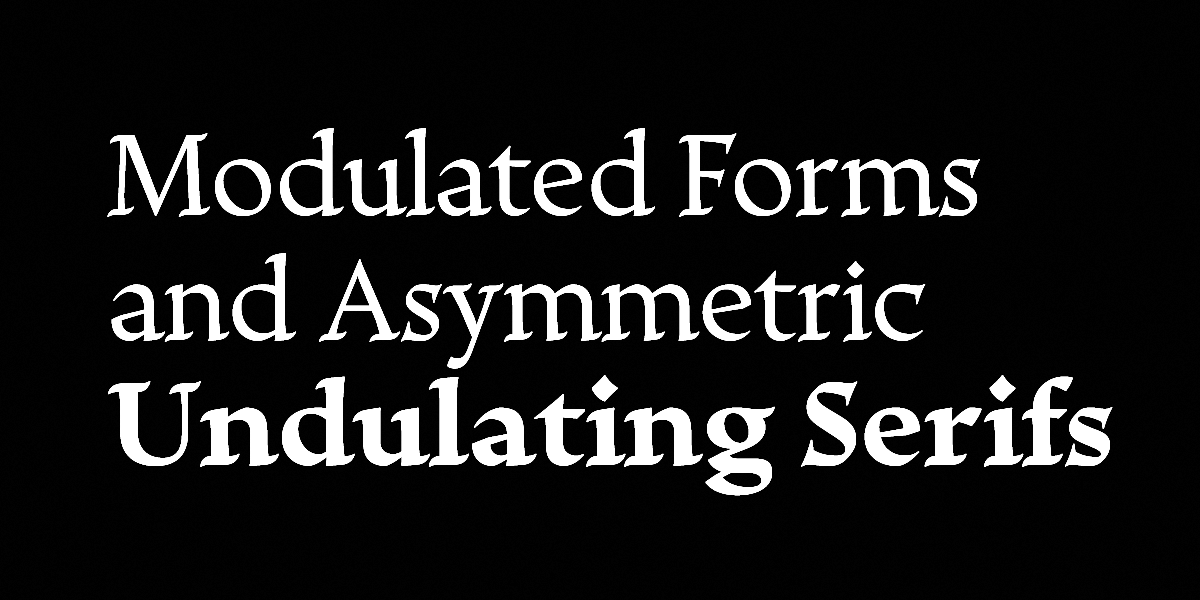
[3] Letterform personality (strokes and serifs).

[4] Escritura typeface have two different optical sizes, text (small sizes) and display (large sizes).

[5] Even though they were designed to work harmoniously with each other, the italic is structurally different from the roman, especially in the lowercase. The letter forms are skewed at an angle of 10°, more condensed and narrower than their roman counterparts. Some of the capitals have distinctly different terminals such as the leg on the ‘K’ and ‘R’, to better match the lowercase characters. In contrast with the rounder, flowing shapes of the roman, the italic is energetic and vivacious, revealing the nature of the pen stroke in the in- and outgoing strokes. The old style figures are also different from the titling variants, with a crisp design that remains close to the lowercase forms, maintaining the same rhythm and formal connections.

[6] The italic has a second variant with swash capitals. The proportions of these capitals are more horizontal than the historical chancery models, due to the absence of descending strokes except in the capital ‘G’ and the stylistic alternate for the capital ‘Q’.

[7] The five different weights (regular, medium, semi bold, bold and extra bold) of the Escritura family create a simple and dynamic visual typographic hierarchy. The heaviest and darkest style is the extra bold weight, with strokes that are twice the width of the regular. Going heavier than this value would distort the formal structure and general proportions of the typeface.
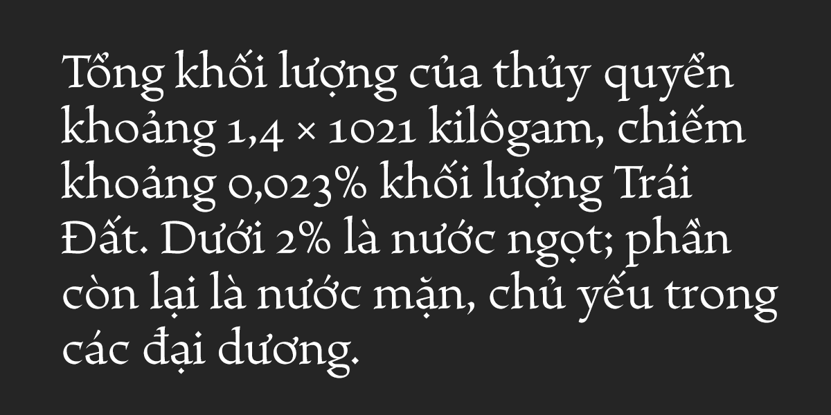
[8] This font family support different languages (Afrikaans, Albanian, Asturian, Basque, Breton, Bosnian, Catalan, Cornish, Croatian, Czech, Danish, Dutch, English, Esperanto, Estonian, Faroese, Finnish, French, Galician, German, Greenlandic, Guarani, Hawaiian, Hungarian, Ibo, Icelandic, Indonesian, Irish, Gaelic, Italian, Kurdish, Latin, Latvian, Lithuanian, Livonian, Malagasy, Maltese, Maori, Moldavian, Norwegian, Occitan, Polish, Portuguese, Romanian, Romansch, Saami, Samoan, Scots, Scottish Gaelic, Slovak, Slovenian, Spanish (Castillian), Swahili, Swedish, Tagalog, Turkish, Vietnamese, Walloon, Welsh and Wolo).

[9] Terminal forms.

[10] Standard and discretionary ligatures.

[11] Combining the different font versions.

[12] Linoleum carving experiments.

[13] Escritura wood carving experiments.

It was my first attempt to drawing a Hebrew alphabet for mach directly with other typeface (Latin) which I already designed. The Latin version is an handwriting display typeface influenced by chancery handwriting from the Italian Renaissance (broad-nib pen). One of the most typographic characteristic is there wavy forms, especially the serifs, where contains some of the main calligraphic references from this font family. The Hebrew script contain reverse contrast, the vertical proportions are more tall and the stroke weight is slightly more strong than latin lowercase to produce a correct visual balance between them, especially on small sizes (text proportions). This Hebrew square book-hand was influenced by Sephardi script style. The Latin characters contains interrupted strokes, the same was made for Hebrew letterforms to transpose correctly the same calligraphic approach between these two different alphabets. Special thanks to Liron Lavi Turkenich.
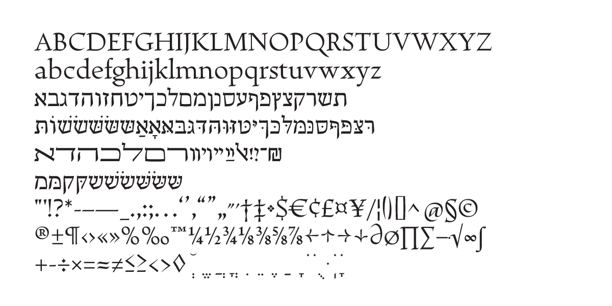 14) Escritura Hebrew (Sephardic Square Book-Hand).

15) To create the Hebrew terminals its was taken from the Latin ascenders strokes the same detail to transpose an similar calligraphic approach between this two different alphabets.

16) Hebrew vertical proportions are more higher than Latin uppercase letterforms to look more harmonize when they are combine together, the thicknesses is slightly different between these two different alphabets to produced the same optical text color (weight and contrast).

17) Available font weights.

18) Hebrew stylish alternate characters.
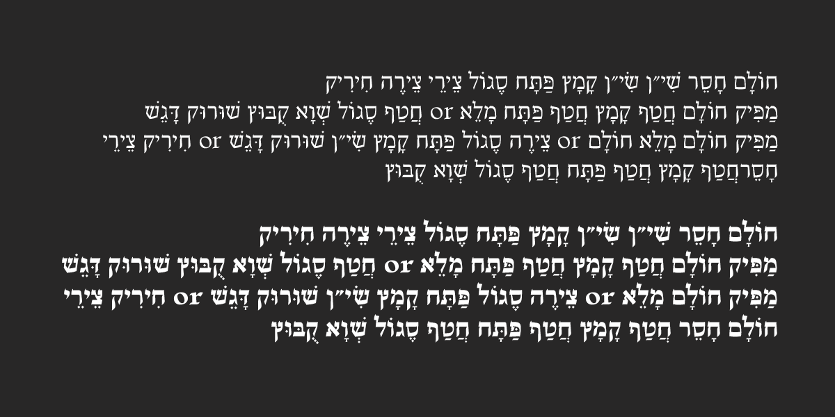
19) Hebrew diacritics.

 14) Escritura video promo by Rui Martins (Motion Landscapes).
