No Momento (Documentary) Newspapers Design

“In the Moment – Vitor da Silva and Newspaper Design” which premiered in 2018 is finally available online. Produced and directed by Rui Martins, with interviews by Ricardo Santos, also includes the collaboration of designer Fernando Coelho and of the National Letterpress Museum (Porto). This documentary contains english captions. Documentary Website: Motion Landscapes Facebook: NoMomento [18/02/2020]


 The handwriting typeface Escritura was created for editorial purposes and the letter forms are influenced by chancery handwriting from the Italian Renaissance. The asymmetrical shapes of the undulating serifs cause the characters to have a large aperture. Originally designed for display sizes, the typeface also comes in a text version for small sizes. With taller vertical proportions, the text version has slightly longer serifs and increased white space between the characters to optimize legibility in small sizes.
 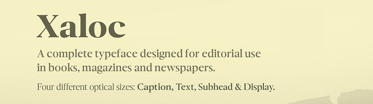 Xaloc was designed for editorial use in books, magazines and newspapers. This typeface family contains different font versions for different optical sizes; Caption, Text, Subhead and Display, all of them with different x-height proportions and contrast. Its design approach enhances text flow and continuous reading. Xaloc is the Catalonian name from the Mediterranean wind that comes from the Sahara and reaches hurricane speeds in North Africa and Southern Europe.


