ABOUT THIS TYPEFACE
It was my first attempt to drawing a Hebrew alphabet for mach directly with other typeface (Latin) which I already designed. The Latin version is an handwriting display typeface influenced by chancery handwriting from the Italian Renaissance (broad-nib pen). One of the most typographic characteristic is there wavy forms, especially the serifs, where contains some of the main calligraphic references from this font family. The Hebrew script contain reverse contrast, the vertical proportions are more tall and the stroke weight is slightly more strong than latin lowercase to produce a correct visual balance between them, especially on small sizes (text proportions). This Hebrew square book-hand was influenced by Sephardi script style. The Latin characters contains interrupted strokes, the same was made for Hebrew letterforms to transpose correctly the same calligraphic approach between these two different alphabets. Special thanks to Liron Lavi Turkenich.
TAGS
Hebrew, Sephardic, Square Book-hand, Serif, Text, Non-Latin, Text, Reverse Contrast, Calligraphic
BUY

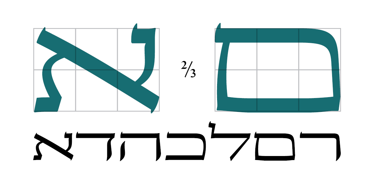
 [1] To create the Hebrew terminals its was taken from the Latin ascenders strokes the same detail to harmonise the calligraphic approach between this two different alphabets.

[2] Hebrew vertical proportions are more higher than Latin uppercase letterforms to look more harmonize when they are combine together, the thicknesses is slightly different between these two different alphabets to produced the same optical text color (weight and contrast).

[3] Available font weights.
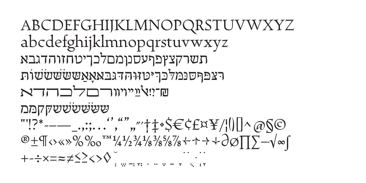
 [4] Main characters.
 [5] Available characters.
 [6] Hebrew stylish alternate characters.
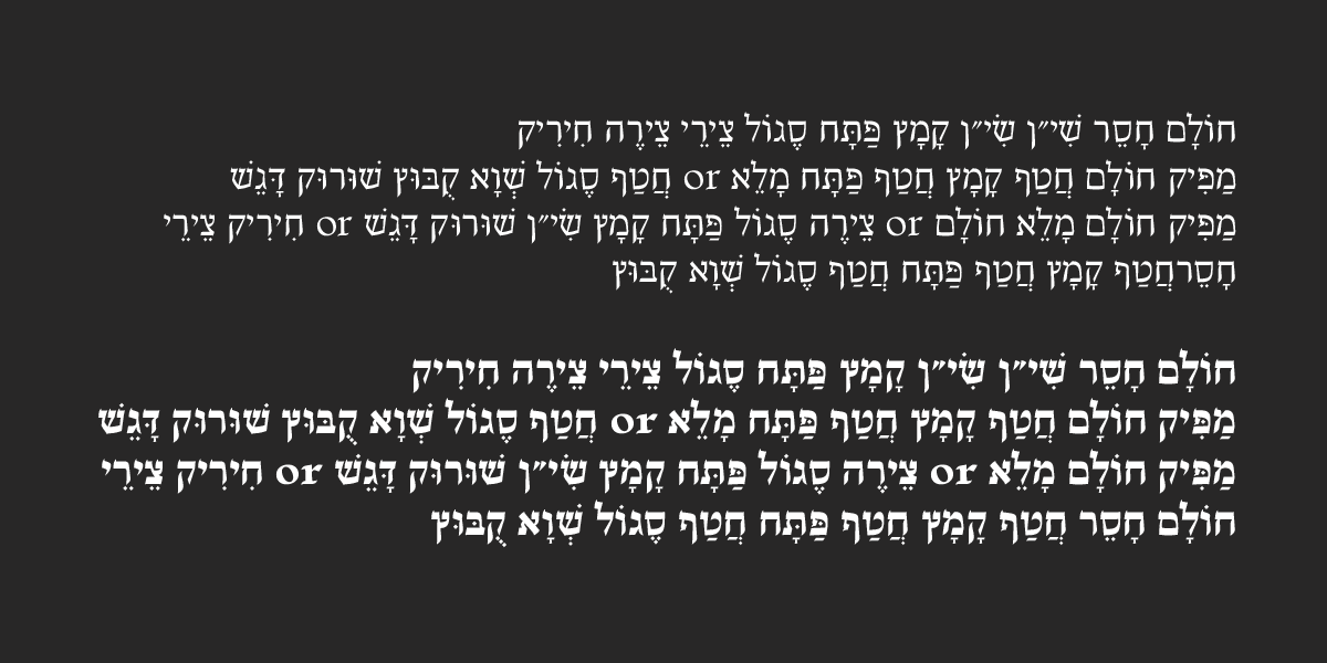
 [7] Hebrew diacritics.
 [8] End-of-word letters (Sofit).

[9] wide letters (Otiyot Rehavot).


