GAZETA SLAB

This humanist slab-serif style is an extension from Gazeta font family, the design is more sharp, racional and mechanical. Available to buy (Fontspring). [19/11/2018]
This humanist slab-serif style is an extension from Gazeta font family, the design is more sharp, racional and mechanical. Available to buy (Fontspring). [19/11/2018]

Escritura Hebrew is Sephardic square book-hand typeface designed for small sizes, available on Myfonts. [19/10/2017]

Escritura Hebrew is already available to buy on Fontspring website, you can have the opportunity to try one font (Demi Bold) for free. [08/09/2017]

Gazeta font family is available to buy on Fontspring website. [08/09/2017]

Now you can find Escritura typeface available on the Linotype font catalog (website). Linotype.com [10/11/2015]
 The handwriting typeface Escritura was created for editorial purposes and the letter forms are influenced by chancery handwriting from the Italian Renaissance. The asymmetrical shapes of the undulating serifs cause the characters to have a large aperture. Originally designed for display sizes, the typeface also comes in a text version for small sizes. With taller vertical proportions, the text version has slightly longer serifs and increased white space between the characters to optimize legibility in small sizes. Myfonts.com Fonts.com Linotype Specimen: issuu.com [11/06/2015]
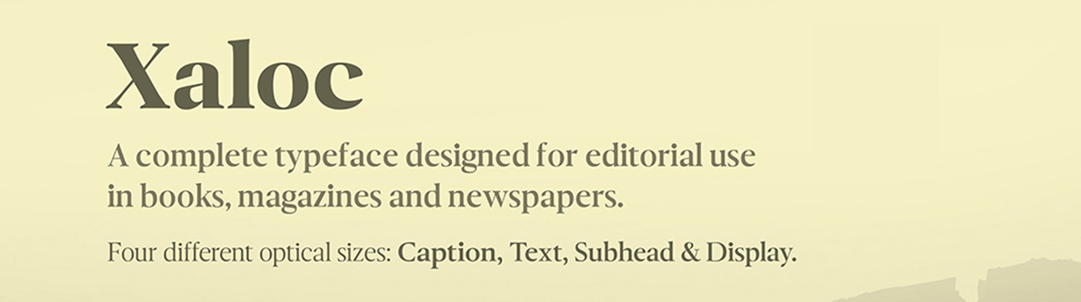 Xaloc was designed for editorial use in books, magazines and newspapers. This typeface family contains different font versions for different optical sizes; Caption, Text, Subhead and Display, all of them with different x-height proportions and contrast. Its design approach enhances text flow and continuous reading. Xaloc is the Catalonian name from the Mediterranean wind that comes from the Sahara and reaches hurricane speeds in North Africa and Southern Europe. Myfonts.com [15/05/2015]


