ABOUT THIS TYPEFACE
Aircrew is a neutral, humanist sans-serif family optimized for signage applications in display sizes. Its large x-height enhances readability and its letterforms help distinguish characters from each other, increasing legibility. Aircrew has vertical terminals, low contrast, and short ascenders and descenders. The weight variations between uppercase and lowercase characters provide the perfect balance and its slightly condensed proportions allow more words to fit in less space. There are two different versions of Aircrew, positive and negative. This avoids optical effects that cause uneven thickness and unsteady readability in either light or dark backgrounds. Special thanks Iñigo Jerez, Eduardo Manso, Raül Vicent, Nadadora and Luis Alonso.
TAGS
Display, Sans-Serif, Humanist, Signage, Wayfinding, Positive, Negative, Tiponautas
BUY


[1] Available in several weights.

[2] Designed for different backgrounds (Positive and Negative).

[3] Typeface vertical proportions (Display).

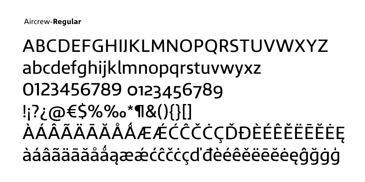
[4] Typeface characters.
 [5] Stylistic alternates characters (.ss01).

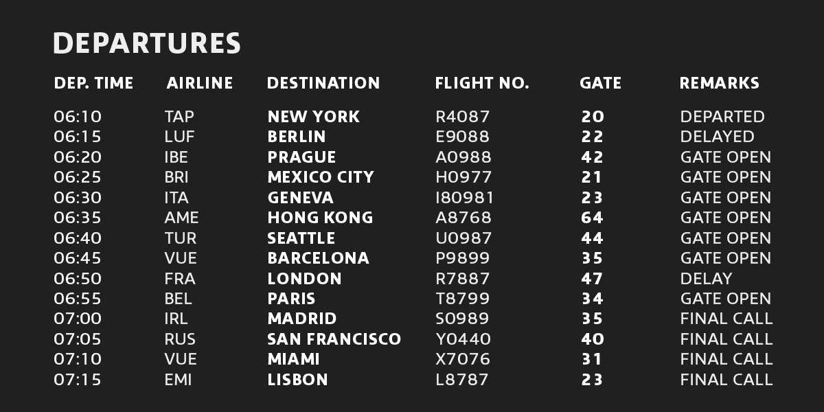
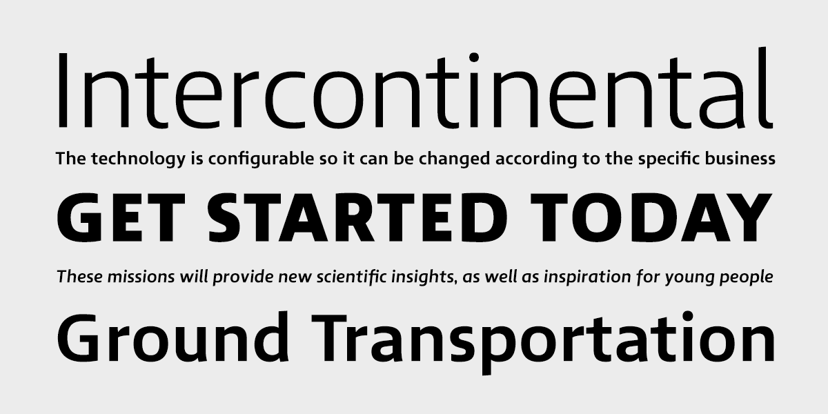
[6] Testing Aircrew on display sizes.


STATE OF ART (FROM MY RESEARCH)
Chronological analysis of typefaces designed for signage (decades)
1901 Metropolitan
1923 DIN 1451
1931 London Underground
1945 FHWA Fonts
1954 Esseltub
1954 Toronto Subway
1957–1963 Transport
1959–1961 Alphabet Orly
1965 Trafikkalfabetet
1969 Tipo Metro
1972 Alphabet Roissy
1972 Merkeur
1972 SNV
1973 Alphabet Métro
1974 M.O.L
1974 Metron
1975 Frutiger
1984 RET2
1995 Metrolis
1996 Parisine
1997 Casey
1997 FF Transit
1997 ANWB-UU
1998 Capitolium
1999 Interstate
2001 Tratex
2001 Foundry Sterling
2002 Vialog
2003 Korail
2004 Clearview
2004 Arrival
2004 Forum
2005 FF Info
2006 Brusseline
2009 Britanica
2009 Metrolink
2009 Dsignes
2009 Wayfinding Sans
2009 Metro Dubai
2013 Brisbane
2015 FS Millbank
2015 Moscow Sans
2016 Aircrew
2019 Jali
