ESCRITURA
 The handwriting typeface Escritura was created for editorial purposes and the letter forms are influenced by chancery handwriting from the Italian Renaissance. The asymmetrical shapes of the undulating serifs cause the characters to have a large aperture. Originally designed for display sizes, the typeface also comes in a text version for small sizes. With taller vertical proportions, the text version has slightly longer serifs and increased white space between the characters to optimize legibility in small sizes. Myfonts.com Fonts.com Linotype Specimen: issuu.com [11/06/2015]
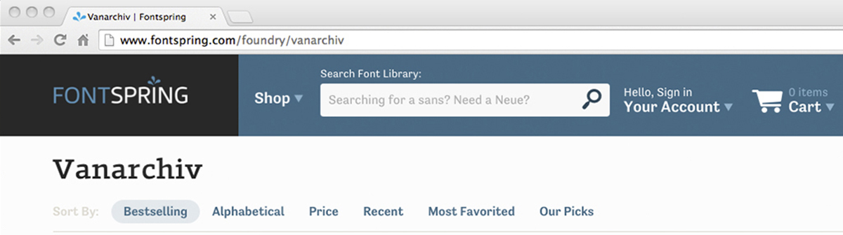 Now you can find our typefaces on FONTSPRING website, the first release was Van Condensed typeface. The associated
 Tipos das letras went to Bergen (Norway) to made Ruha Stencil workshop at

 Typography exhibition at La Panera (Lleida). From February 8th to May 25th 2014 exposed at Centre d’art la Panera (Lleida), the Exhibition Lletres d’estudi, a collection of letters and characters created by students of EINA’s Màster en Tipografia Avançada, in the courses Arquitecture of Alphabers and Digital Construction, with professors Íñigo Jerez, Laura Meseguer and José Manuel Urós.