Van Condensed Hebrew

Van Condensed Hebrew was designed between 2020–2022, this extended font family is now available by Myfonts and Fontspring. [04/04/2022]
Van Condensed Hebrew was designed between 2020–2022, this extended font family is now available by Myfonts and Fontspring. [04/04/2022]

Miragem font family is available, you can find in Myfonts and Fontspring. [05/11/2021]
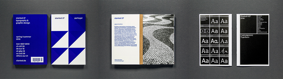 The Slanted #27 (Portuguese design scene) contains also the Contemporary Typefaces 2016 booklet, where the Escritura font family was one of the fourteen selected typefaces from that year. [09/06/2019]
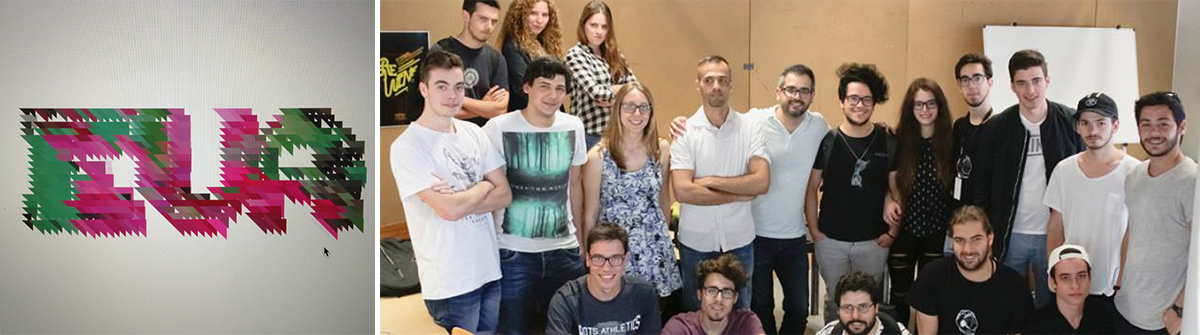 Photos from the Infected Letters workshop during the EVA event at (ESAD.CR-Caldas da Rainha) Portugal, taught by Ricardo Santos and Marco Heleno. Letters composition and their shape exploration by applying an algorithmic process of picture transcoding. Workshop Photos (Flickr). [01/06/2016]
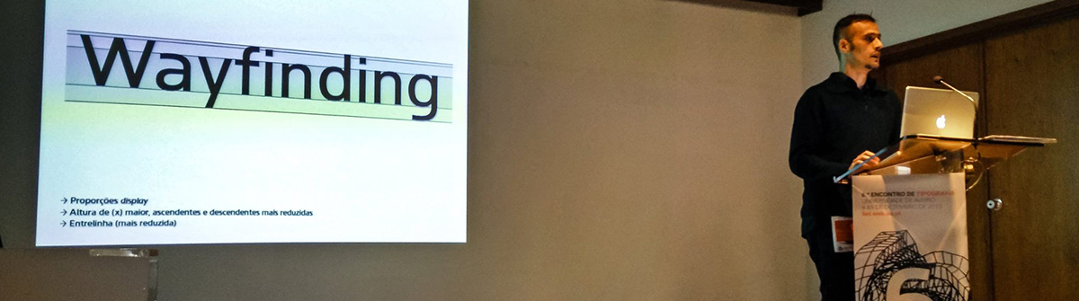
During December (2015) I was invited by 6th Typography Meeting in Aveiro University to presented my Aircrew typeface, which was designed for signage proposes. Will be available soon. UNIVERSITY OF AVEIRO, Website Event. [22/05/2016]

Grafia Sans is a geometric humanist sans-serif with close terminals, which was originally designed as a custom brand typeface for the YoYo studio (Barcelona) 2005. Originally the YOYO studio used Helvetica on there own branding and they wanted to maintain the same typographic neutral atmosphere. After all this years this typeface family was redesign and finished to be published. Mfonts.com and Linotype. [09/05/2014]
[/vc_column_text][/vc_column]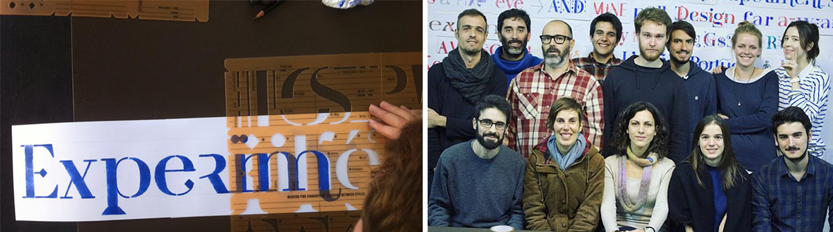 Ruha letter stencil, a multi stylistic typographic system workshop (EXD15). This project was initially developed as a teaching tool for graphic design students to learn from experiment letter shape as a significant in graphic communications. Afterwards, it imposed itself as an autonomous project, materialising into a product for all the community. Experimentadesign and Tipos das Letras. [28/11/2015]
Now you can find Escritura typeface available on the Linotype font catalog (website). Linotype.com [10/11/2015]
 Xaloc typeface designed by Tiponautas was selected as one of the text fonts of the month (June-2015). Myfonts.com [05/06/2015]


